Friday, 26 June 2009

Vertigo


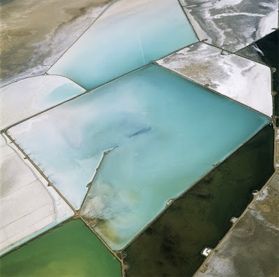
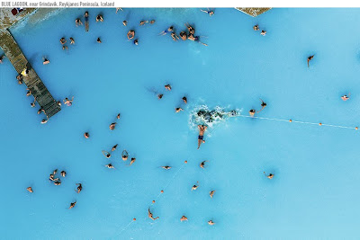
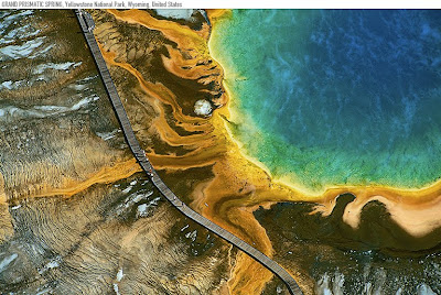
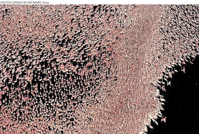
It's not often we can get ourselves up to such a height that we can see the world directly from above, I can think of few opportunities when most of us do see the world from this different perspective, perhaps only when we are able to go to the top of sky scrappers and see views across a city or we might catch a glimpse through the window of a plane as we take-off and land. Even on these rare occasions we are often left amazed at how small things seem and the height distance gives us a warped perspective making it all seem surreal. With this small amount of personal experience I am always amazed when I get to see photographs of our planet from above mainly because in that moment I am suddenly made aware of the beauty that our planet has and what amazing rock, water land formations which we live amongst. The variations of natural earthy colours against the newer manmade forms and how the the light from sunsets, sunrises, moon and sun reflect differently on landscape when seen from above rather than on a horizontal plane. It is like seeing our world through different eyes.

I have recently come across two photographers, Yann Arthus-Bertrand and David Maisel who are lucky enough to see the planet from this angle when they are at work and who both enjoy a passion for placing themselves at a height over land and sea so they can document what they see. It must be an amazing sensation to see something from ground level and then to experience the view from above. Some locations that Yann and David have visited for their photography are so distant from civilisation that to see them on any level is amazing enough but what they have come back with is awe inspiring, stunning and beautiful if not a little abstract.

David Maisel- The Mining Project


Wednesday, 24 June 2009

Coming To A Cinema Near You


I went to watch 'The Hangover' last night, I thought it was a very funny film. I am not sure what got me to go see that film in particular but it could have been a mixture between seeing the advertising on the side of the London buses and the trailer. Before the film started I watched 4-5 trailers for other films "coming out soon" and I started to think about how influential these are in persuading us to go watch a film. What makes a trailer so compelling that we are persuaded to take the time to head to a cinema, pay money and spend an evening sitting watching. The impact a trailer can have on the success of a film is huge and although in itself a big money making part of the film industry without them the millions initially spent on making the film could be lost without trace if no-one pays to go see it once released.


In the past week Michael Bay, Director of the Transformer sequel Transformers: Revenge of the Fallen, has criticised Paramount Pictures for the publicly surrounding the film, quoted in an email to them as saying "You talk so glowing about transformers being the movie of the summer, but unfortunately this has not got to the public....right now we are not an event, we are a sequel, which is very different. There is no anticipation". The advertising in the lead up to a film can make or break it in the box office and Michael Bay was feeling the effects of this on the release. A film in itself could be mesmerising and enthralling but in order to excited people enough to make them feel like they are missing out on something then an exciting trailer has to be a major component in the publicity campaign which surrounds a films launch


There are awards for this division of the film industry, Golden Trailer Awards and they were recently held on the 4th June 2009 in Los Angeles. There are 13 categories ranging from action and horror to romance and best music. Above and below I will post some of this years winners so that you can judge for yourself if you think they are worthy winners or not. I am now researching some of the best trailers of the past few decades as I know I have sat in the cinema and watched a trailer which had more impact on me than the following 2 hours I spent watching the actual movie I paid to go see. I have watched trailers which made the hairs on my arm stand on end and brought a tear to my eye and trailers where everyone in the cinema can be heard saying "oh I must go see that". So if there are any you have seen and which stand out in your mind please let me know and I'll post another blog of the 'best trailers of the past decade'.

Monday, 22 June 2009

Don't Blink Or You'll MIss It

We can see something in front of our eyes and not truly see it all. When things happen so fast, or too fast for the eye to capture there is always a series of events we have completely missed. In 1877 Eadweard Muybridge was enlisted by the Governor of California Leland Stanford to prove his claim that all four hooves of a horse left the floor while galloping. Eadweard was well known for his for work with multiple cameras to capture motion and his work in the late 1800's is still being used in cinema projection today. He set out to answer Stanford's claim and set up a series of 24 cameras, 21 inches apart over a distance of 20 feet. The camera's where arranged parallel to the track and had trip wires which were triggered by the horses hooves. The final result is a series of moments which flow together to give you the over all visual of what a horse looks like as it gallops, successfully proving that all four hooves do leave the floor.

This might seem commonplace for us now with all our modern technology, something which we see quite often while watching sport to see if a ball was in or out of play. We slow down historic footage such as JFK's assignation to try and work out what happened, we also like to artistically slow down footage of events to extend the time the image can been seen.


However sometimes there are events that simply happen within our home and that our eye cannot capture, but to slow it down you see a surreal beauty of motion in action. Something so much faster than the eye is the speed of a bullet and the impact moment which is also very dramatic when slowed down to a moment. Above and below are a few examples and to search online you'll find there is a world you have never seen before and it's captivating and addictive.

Thursday, 18 June 2009

We'll Cross That Bridge When We Come To It

“We are told never to cross a bridge until we come to it, but this world is owned by men who have 'crossed bridges' in their imagination far ahead of the crowd.”

Julian Hakes lives opposite me and is a friend but also an amazing architect striking out with his own company Hakes Associates, through his studio window I see him working away into the late hours and the following morning you might see a new model appear, a new concept drawing or even himself bounding around telling you of his great ideas. What he has is a unique talent for bridges, listening to him go into detail about the ideas behind them and the journey he takes in developing the designs is inspirational. What I thought were small perimeters to design within are in fact one of the reasons why the structures Julian comes up with are so enthralling. I never really thought that much about what makes a bridge successful until the Millennium Bridge was opened in London and it wobbled so much on opening day that people fell over. After seeing this I realised that the design and engineering of a bridge is an incredibly complex thing and great minds have to come together to realise a concept from start to completion.


I have crossed certain bridges just so I could walk along the amazing structure, to test how it feels to be on the bridge, maybe under tension cables or maybe just on a structure which you're left wondering how it holds together. Julian has a bridge in production called the Mobius Bridge and it is a amazing feat of design and engineering with the bridge being 'independent of either river bank' it is astounding to see and one of those bridges you would like to experience and not just to get to the other side but for the pleasure of seeing it up close and in detail, to see how it is constructed and the visual journey it takes you along. From this concept Julian has now expanded the design into a shoe, his mind know no limits and a true creative inside out.

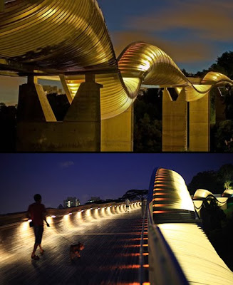
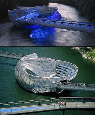
Today I was emailed a link showing a series of unusual and creative bridges and I thought I would post one or two here to show you their unusual forms and to help explain how bridge design is being pushed forward. Bridges have always had interesting forms through basic needs of structure but now we are revisiting these forms & function and challenging what we have always perceived the shape of a bridge to be, this new generation of bridges are a welcomed change to our built horizon.

Wednesday, 10 June 2009

Happy Camper

" I got into an argument with a girlfriend inside of a tent. That's a bad place for an argument, because then I tried to walk out and slam the flap. How are you suppose to express your anger in this situation? Zipper it up really quick?" - Mitch Hedberg


I'm not your typical camper, maybe my lack of camping until i got to the age of 21 has something to do with this. The first time I stepped foot inside a tent was at a music festival in the UK. I remember turning up in a group of 6 with our borrowed 2 person tents, standing in a field in the English countryside and not one of us had a clue as to how to put them up. We tried for several hours and finally some other helpful (helpful because we bribed them with beer) festival goers saw our dilemma and erected out tents for us. Phew thank god otherwise I fear we may have slept out with the cows in the field all weekend. Since then I still haven't managed to get my mind around pitching a tent however recently there has been a new movement in redesigning the basic structure of a tent and these look like a challenge to me. I might have to start getting my backpack out and heading off into the back and beyond just so i have an excuse to try and pitch one of these.

A designer who is using his sculpture skills to create some amazing structures is Dré Wapenaar who operates a design studio in Rotterdam/ Netherlands. He is has come up with some genius ideas, some more ascetically pleasing than practical but it's about pushing the boundaries of our perception of how we use a tent. A tent was a nomadic persons first house, when to survive you travelled for food, you had tents only for shelter when all your processions would fit on your back. Since then the basic structure hasn't changed too much, some modern comforting factors have come into play but basically it is still the same concept of water repellant material pinned on poles and stretched out with rope. However because we haven't really moved that far away from this it doesn't mean we shouldn't and Dre Wapennarr has tested some of that by placing tents in tree's and elevating structures above ground although the basic principles of what hold a tent up are still in play.


Another would be Markus Michalsky and his Piilo indoor tent, making a design which is to 'create an interior as a private secret retreat'. This is just preliminary concept of a design so the ways in which this could be developed is endless. The skill involved in to putting this up is also minimal and the idea of that is pleasing, it does literally go in a bag over your shoulder and folds out for use and as Markus states it 'encourages personal spontaneity and flexibility'.

However one tent already in production and which would have helped me with my first experience of camping is the Quechua 2 Second Tent. You literally throw it up in the air and it falls down already erect and ready to go.


Monday, 8 June 2009

Painted Skin

I've always wanted a tattoo, something unique and hidden and over the years I have come up with many designs and said that if in 3 months I still like this design then I'll have it done....3 months later I don't and move on to another design. I'm not sure I'll ever like anything permanently & forever so for me self-etching will not likely happen. However I do still love tattoos, not your rose on a shoulder or Chinese symbol on the back but masterful skilled tattoo's.


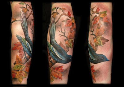
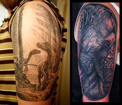
Tattoo's always have some stigma attached to them, they have in the past carried an association with drinking, fighting, trouble making and are frown upon by parents and seen as an act of rebellion. However in recent years we are moving away from this and realising that this is a great medium of art and many people are having the most amazing designs placed on their skins. Too book in with some of the top tattoo artists can take months with huge waiting lists and there are some amazing artists with a great level of talent. Think about how a tattoo is created, a small fine pin pricking the skin and injecting ink that takes some skill to created tonal difference, complementing colours and definition and I admire this. One such lady I have found via Myspace is Jo Harrisonand her studio Modern Body Art she has created some amazing work, another is Mike Devries. I think it's brilliant that people use their bodies as a canvas for someone else's work it is a real expression of choice, however there are tattoo's and there are tattoo's.


Friday, 5 June 2009

Thousand-Hand Guan Yin

As long as you are kind and there is love in your heart
A thousand hands will naturally come to your aid
As long as you are kind and there is love in your heart
You will reach out with a thousand hands to help others

Happy Friday, I thought I would post something a little more uplifting for the weekend. I found this video and thought it was really beautiful. However it has became even more amazing the further I researched the dance. Tai Lihuna is the Art Diector and the 21 dancers she choreographs come from a group called China Disabled People's Performing Art Troupe, all 21 dancers are deaf. The meaning behind the dance comes from Buddhism and this is how they explain it.


Guan Yin is the bodhisattva of compassion, revered by Buddhists as the Goddess of Mercy. Her name is short for Guan Shi Yin. Guan means to observe, watch, or monitor; Shi means the world; Yin means sounds, specifically sounds of those who suffer. Thus, Guan Yin is a compassionate being who watches for, and responds to, the people in the world who cry out for help.


Have a nice weekend.

">

Thursday, 4 June 2009

MSCE- Make Something Cool Everyday

For 365 days a group of people have decided to push themselves to Make Something Cool Everyday and upload it to a Flickr Group. Why this is so interesting is that there are days when you want to turn your brain off and do nothing, those days when you feel anything but creative. However those are sometimes the days when you find a little gem of a design inside of you. Pushing yourself when you don't want to, fighting against time restraints and other daily life activities is sometimes when you test your creative abilities the most. Also there is something inspiring about looking back at what you have created you see the start of new routes of work, like a personal diary of work which you can take further or draw on at a later date. Some work you will realise were one time pieces which will lead nowhere ecept for that one moment, some though can lead you into a whole new world of experimentation and without intially pushing yourself to make something cool everyday you would never have seen it within yourself.


I am considering starting next week and becoming a member of MSCE, I admit that I am finding the idea pretty daunting. Am I going to run my creative juices dry by doing this? Do I even have enough in me to get beyond a fortnight? I think it's unnerving and a test to produce something everyday. I feel like I am approaching this with the same apprehension as someone who is quitting smoking or taking up exercise, the good will is there but do I have the strength to stay focused. However on reflection I do create something new most days anyway so i should put together a record of it. I am finding inspiration from the work I have seen already posted in this group, there are some amazing concepts & pieces coming out of it and to have my work up along side these would be worth the attempt to MSCE.


Tuesday, 2 June 2009

Life Isn't Measured In Minutes, But In Moments

I love going to the movies, I love the excitement of buying the ticket, popcorn and then finding a seat before the lights go down. I love the dolby surround sound starting up, the trailers and making a mental note of what to come back and see. I love the lowering of the lights and everyone going quiet as the film finally starts and then being completely absorbed into the screen for a couple of hours. There is really nothing like it, even just writing that I have got myself excited about it so I will plan on going to see something this weekend.


Around Oscar time I'll always like to head out to see most of the films that are up for nomination. Normally so I can sit back and agree or shout out "fix, Angelina was so much better than Kate Winslet" or something similar! I don't always agree with the Oscars though as i think there are so many films that are completely ignored but this is the way of Hollywood and I admit I always get wrapped up in the glamour of it. The only problem is that most films that are up for nomination have so much Oscar hype surrounding them for the weeks leading up that I always feel slightly let down once I have watched them, as if I must have missed something and wonder why everyone was going so crazy about it. This year however I saw Slumdog Millionaire and loved it, a great story and what a team of film makers coming together for the music and the local knowledge that had to go into making such a film and this was completely well worth the hype. However a film I liked slightly more than that was The Curious Case of Benjamin Button. Production Design by Donald Graham Burt and his team was amazing and happily rewarded with all types of awards from the UK BAFTA and the Oscar. It was a truly remarkable film in all aspects from depth of story to the costume design, the acting and special effects. This was a great example of many talented people coming together and it was not being influenced by one department more than another but as a large team of creatives all doing remarkable jobs in their own right.


What I liked so much about the Production Design is how seamlessly you are moved across different decades. Part of the intricacy in design is to allow the viewer to focus in on how Brad Pitt's character Benjamin Button is aging, or should that be becoming more youthful, without being instantly hit with a change in year. Although this has to be depicted Donald Burt has delicately presented this to you by slight changes and this subconsciously tells you how many years have passed and what is going on in the world at that time e.g. world war, roaring 60's etc.. Effortlessly you are transported through the years with key elements such as a large clock pulling you back to tell you time is passing. In the picture above you can see an example of the amazing thought in detail within the set. The bible verse hanging from the wall which subconsciously explains Benjamin's Buttons situation, the caring embodied cloth for the bibles shows the compassion of the people there, they are all important story & character telling elements. With such a strong story line it would be easy to over design and not work in harmony with the director of lighting, camera etc. and this would create a disconnection within the visual of the film. With The Curious Case of Benjamin Buttonthe film goes almost the other way and you will often find the Production Design borders on minimalist and this in itself has helped to dictated emotions being played out within scenes. Also there is great skill with how the same style has been carried through scenes of different eras even when you are taken back to modern day it has the same elegance as the story set 80 years earlier.

I do think that the story is also very thought provoking and definitely makes you question the viewpoint western society has started developing over recent years on judging others on age and ourselves for aging and gaining more wrinkles. We have become far too concerned with these things and that to age is a fault. Aging is natural and is also something we cannot change and so we should only be worried about the things we can change rather than things we can't.